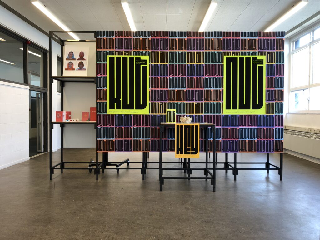
Soms zijn de dagen kut is a visual manifest that puts a smile on your face. Not only by the tone of voice, but also by its bright colors.
With my project, I wanted to brighten up the life of the average student, but how do you do that? Because what cheers me up doesn’t necessarily cheer up someone else. So, as you can see, not an easy task.
Description
My first step was going back to the core. What makes us happy as humans and do personal relationships influence this. With Maslow’s Pyramid in mind, I started to analyze which phase is most important to students. Here I quickly came across social needs. Something we have missed a lot during the past two years during corona. This includes visiting family and friends, but also going out and visiting events. Research also shows that we often find happy people in a crowd of other happy people. This is because our happiness often stems from others. After analyzing several (poster) campaigns and initiatives, I noticed that there is always a serious tone used around this topic. I want to keep a humorous approach through text. Keep it nice and light.
More info
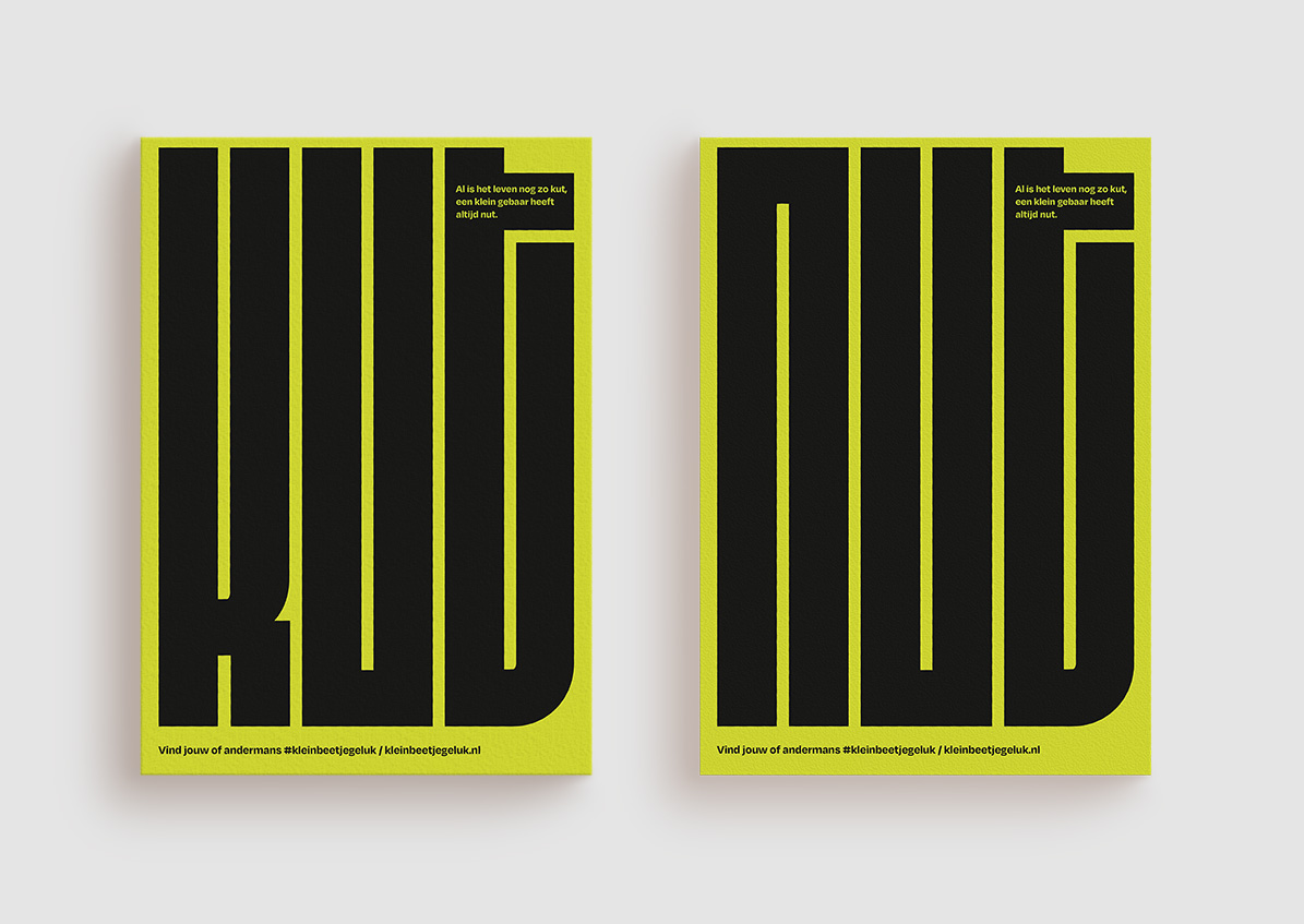
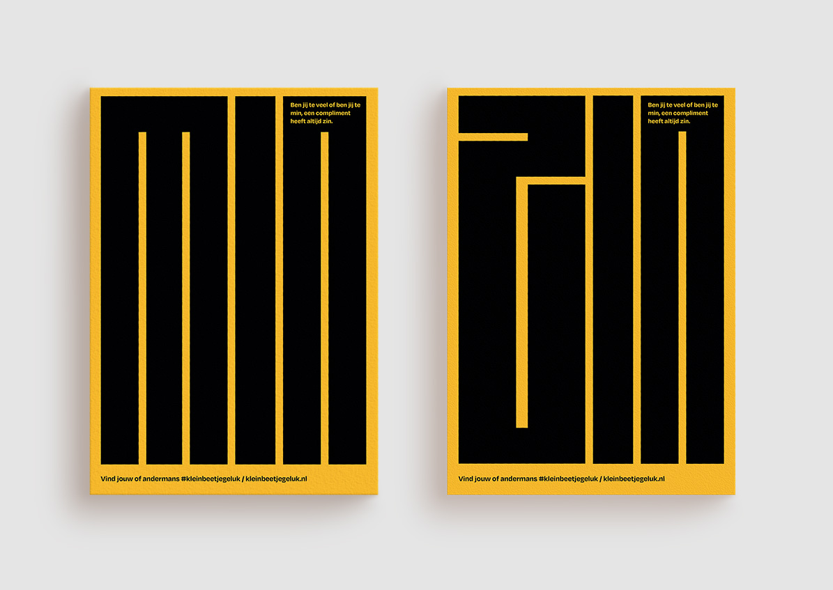
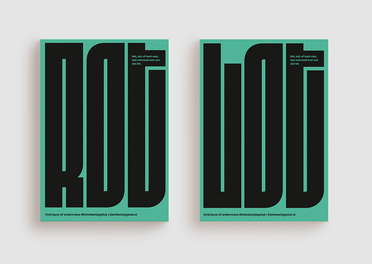
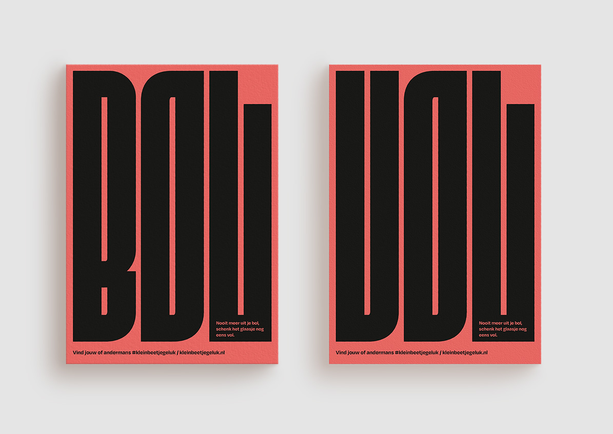
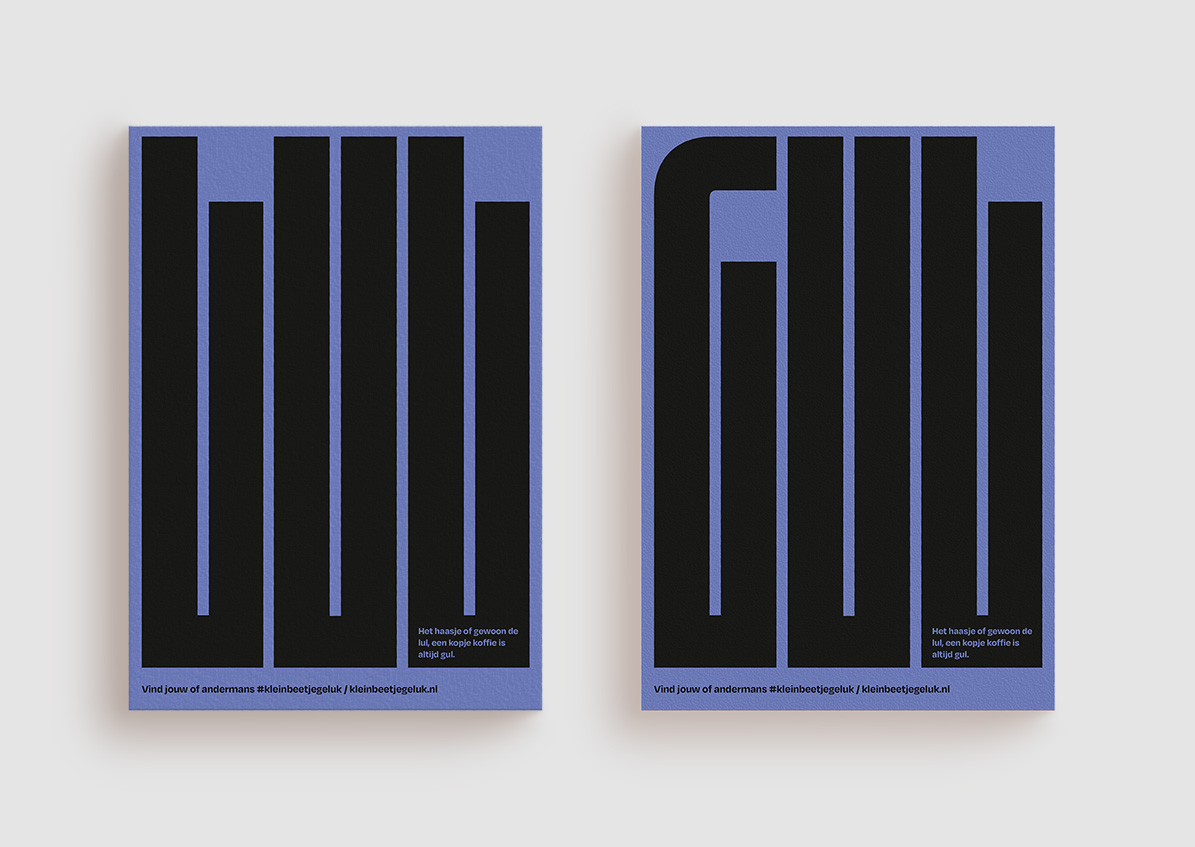
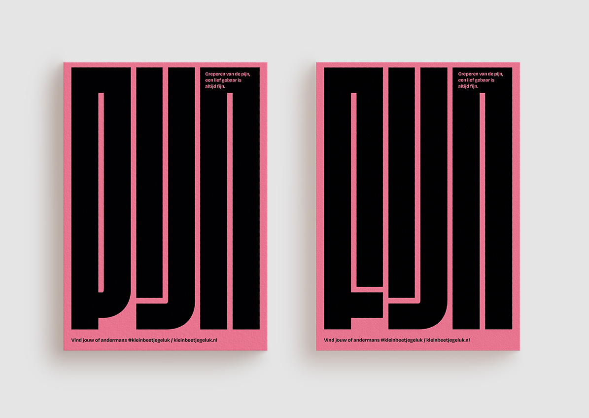
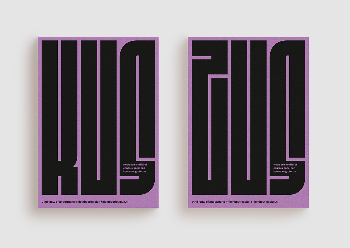
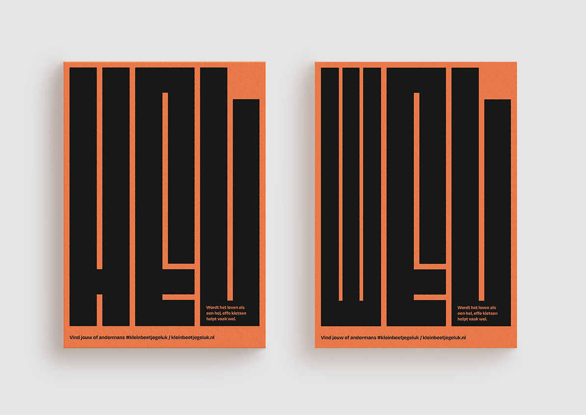
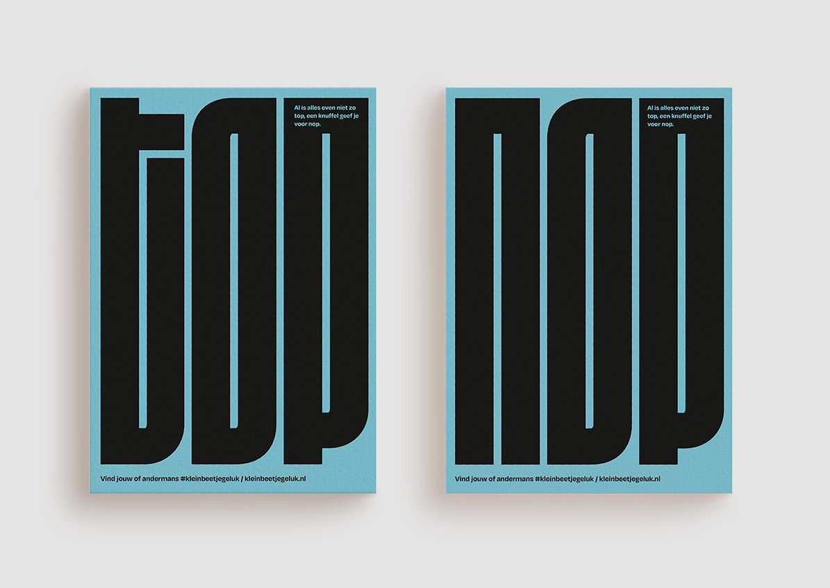
What I learned from my research into guerrilla marketing is that you have to excite the people. This can be done through your tone-of-voice, but it could also be through a certain interaction with the student. I kept my focus on the visual texts and tried to stimulate the viewer through the word choices I made. I use playful texts that are supported by a three-letter word and the hashtag #kleinbeetjegeluk (literal translation #littlebithappiness). The posters will be hung in the most unconventional places so that you are confronted with them. Think of a toilet door, a bus stop or a waiting room. The waiting column gives an extra dimension to my campaign and gives it an interactive element. Here I bring the playfulness of the design back to the execution. Research has shown that the target group is very active online, which is why I use animations that will be shown on various social media channels. Because my campaign isn’t only offline but also online, I reach my target group optimally.
Description
My field research has shown that the design triggers people, not only because it contains bright colors but also because it is not possible to immediately see what it is. This stimulates the viewer to come closer and find out what it means. In addition, it stimulates the viewer to do something small for someone else. By using the selected tone-of-voice and color, my campaign is ‘n Tikkie Brutaal and it stands out from the crowd. I look for the limit and this ensures that I put a smile on the student’s face. They are reminded to do small things for someone else, which ultimately makes them happy too. A win for both parties involved.
The copy:
– Al is het leven nog zo kut, een klein gebaar heeft altijd nut.
– Ben jij te veel of ben jij te min, een compliment heeft altijd zin.
– Rot, zot, of toch mot, laat niemand over aan zijn lot.
– Nooit meer uit je bol, schenk het glaasje nog eens vol.
– Het haasje of gewoon de lul, een kopje koffie is altijd gul.
– Creperen van de pijn, een lief gebaar is altijd fijn.
– Nooit een knuffel of een kus, speel een keer voor grote zus.
– Wordt het leven als een hel, effe kletsen helpt vaak wel.
– Al is alles even niet zo top, een knuffel geef je voor nop.
Details
Services
Branding, Design, Copy
Client
Zuyd Hogeschool
Role
Graphic Designer, Art Director
Date
June 2022