Bagels & Beans focuses specifically on the bagel bread type, which is especially popular in the United States.
Right from the start, Bagels & Beans paid special attention to natural products and conscious eating. For example, coffee beans from a small-scale family plantation in Panama. They believe that healthy, sustainable and delicious go together perfectly. That quality is more important than profit. And that you have to approach life openly: involved, but not pedantic. Everyone makes their own choices.
Description
Bagels & Beans do not work with a central kitchen, but prepare your order where you stand (or sit). From the coffee, tea and bagels to the juices and salads. They are constantly looking for inspiring and special products and ingredients to continue to surprise you and themselves. Whether you dine extensively with a large group or drop by on your way to the office.
Because that surprise, that’s what Bagels & Beans do it for. That you leave happier than you entered. Since 1996, when they started at the Amsterdam Ferdinand Bolstraat. The bagel was extremely popular in America at the time, but hardly known here. They put it on the map in the Netherlands.
More info
Bagels & Beans is looking for a fresh and innovative style to replace the corporate identity they now use.They want something new that makes them stand out.This is because ultimately they also want to grow internationally. For now they’re only known in The Netherlands.The current logo is still very old-fashioned and very standard.This needs change if you want to grow as a brand.
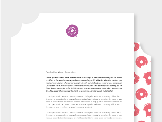
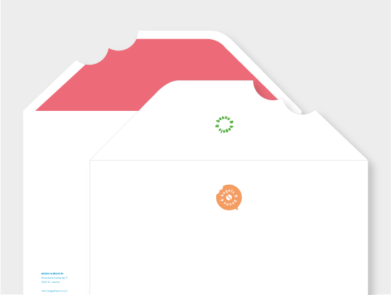
They would like a new design for their interior that can be used in all locations throughout the Netherlands.They also want to use more communication tools.This can for instance be more printed matter, but it can also be done through online marketing.
Description
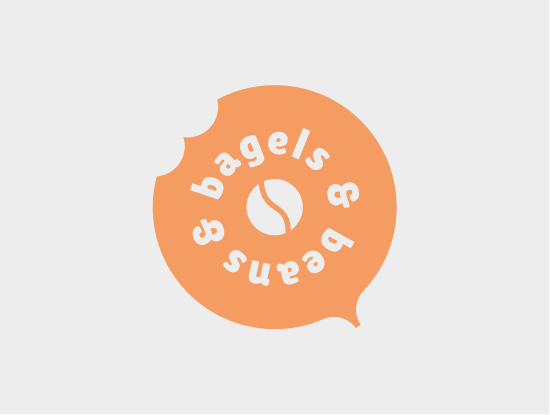
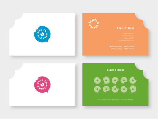
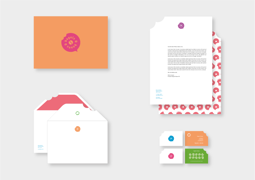
The Bagels & Beans logo is a modern and playful logo that will replace the current Bagels & Beans logo. I represented the playfulness with a bite out of the bagel and throughout the whole corporate identity.
Bagels & Beans wanted colors that stand out, not something you would immediately think about when you see Bagels & Beans, but which does attract your attention. Ultimately, 6 colors were chosen that are used randomly throughout the corporate identity. The typography of the corporate identity of two font families. One is only used for the titels while other is used for titels, headings and other texts.